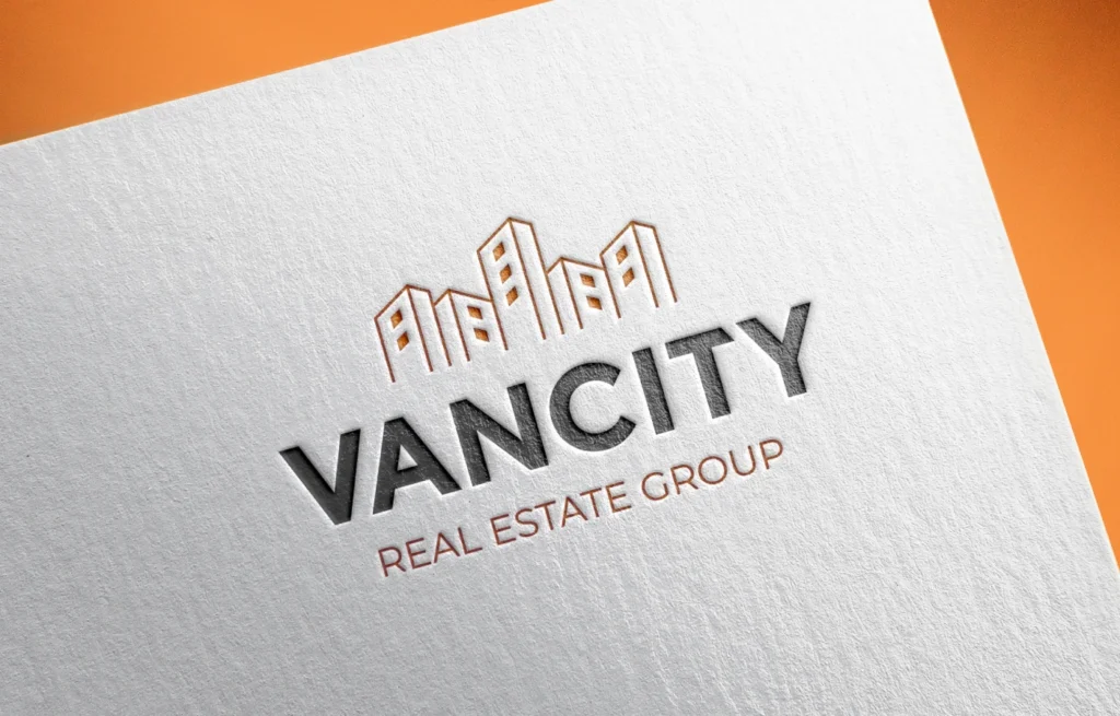
Vancity Real Estate Group – Logo Redesign Case Study

Vancity Real Estate Group already had a logo designed for them, but like many real estate logos out there, theirs was blending in with the crowd. Besides, there were some visual issues with the design. The original logo had too many sharp corners and detailed elements. It felt a bit outdated and wasn’t easy to use across different materials. The typeface was also a challenge—it didn’t offer much flexibility in terms of weight, and it wasn’t very readable, especially in smaller formats. Then there was the colour palette: gold and brown. Gold is so overused by brands trying to look luxurious, but in reality, it’s not the easiest to work with, and not cost effective especially when it comes to print materials. So eventually, they were convinced their logo needed a fresh new look.
Why It Needed a Redesign
The original logo had several issues:
- It contained too many elements and sharp corners, making it hard to use in smaller marketing materials.
- The colour scheme (brown and gold) was commonly used by many real estate agents and businesses offering luxury products or services, which led to poor brand distinction. Besides, it didn’t convey the right message—especially on regular or smaller-sized listings.
- The typeface lacked flexibility—limited font weights and low legibility made it difficult to use across marketing materials and different platforms.
Overall, the logo lacked a modern, memorable presence in both digital and print formats.

What We Wanted to Achieve
- Avoid common real estate clichés: That meant staying away from overused elements like gold colour schemes, serif-heavy fonts, and detailed graphics.
- Clarity, warmth, and visibility: We needed easy-to-read headlines and subheadlines across all marketing materials, along with high visibility for outdoor advertisements such as signage.
Design Direction & Solutions
- Colour Palette
Orange was chosen as the primary colour—it’s underused in the industry, warm, and highly visible in outdoor signage, especially during Vancouver’s gloomy weather.
It was paired with a deep charcoal grey to help the orange stand out while maintaining a clean and professional tone. - Logo Simplification
The original icon had too many details. I simplified the shapes, removed excessive elements, shortened the height, and softened sharp corners to create a simpler, clean, modern look.
This made the logo more versatile, especially at small sizes on business cards, social media avatars, and print collateral.

- Typography
A new typeface was selected with multiple weights and better legibility.
I customized the name by adjusting spacing, rounding or cutting corners, and modifying shapes to create a semi-unique wordmark that isn’t just off-the-shelf.
The improved weight range makes the font easier to read and more adaptable for different marketing materials, both print and digital.

Final Outcome
The redesigned logo has a fresh, modern look that is instantly more recognizable and adaptable. It pops on social media, is more legible in print, and stands out in the crowded Vancouver real estate market. Client feedback and improved brand consistency suggest that the new logo not only looks better but performs better across mediums.
The logo is presented in three background options: white, charcoal grey, and orange. Depending on the material or platform, it offers the flexibility to be used in its original format or with reversed colours—ensuring it remains effective and visually cohesive across all applications.


