In the competitive world of local storage, visibility is everything. Over the past 12 months, Pacific Rim Storage partnered with Long Square Studio to implement a focused SEO strategy — combining technical upgrades, local SEO optimization, and improved content structure. The results speak for themselves: a major boost in organic visibility, stronger user engagement, and […]
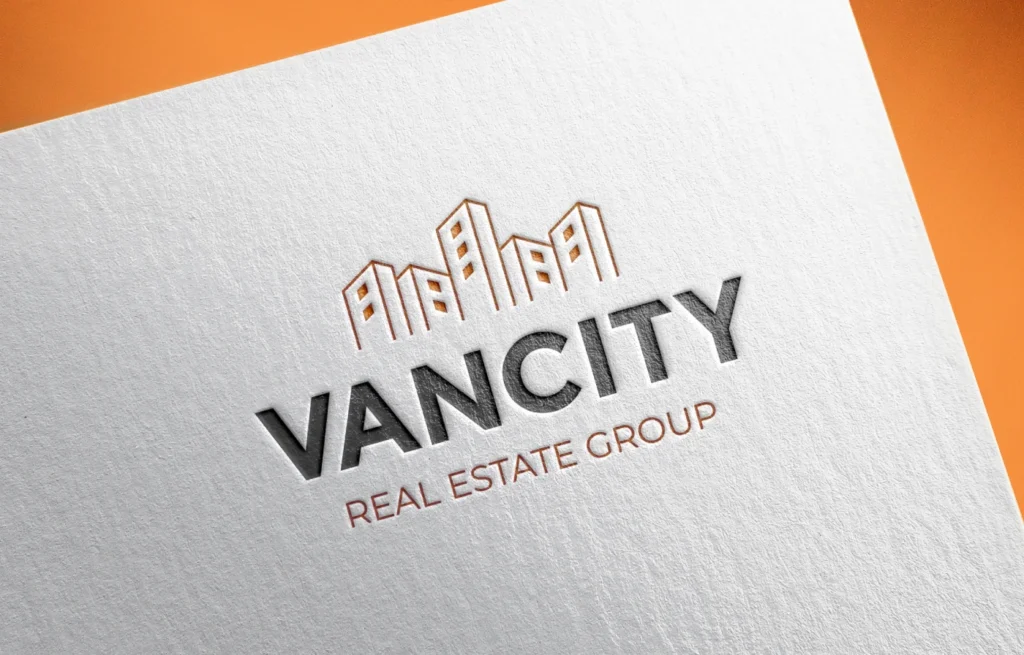
Vancity Real Estate Group – Logo Redesign Case Study
Vancity Real Estate Group’s original logo lacked clarity and modern appeal. We simplified the icon, chose a warmer color palette, and upgraded the typography to improve versatility and brand impact. The new design stands out across all platforms—print, signage, and digital—helping the brand feel more professional, distinctive, and aligned with Vancouver’s competitive real estate market.


